Archive for the ‘product development’ Category

Internal scorecard of a Product

Tuesday, June 6th, 2017

External scorecard and customer satisfaction score calculation have become common, especially amongst SaaS vendors, whereas, there are very few techniques of arriving at an internal scorecard of a product.

The full post at https://medium.com/@1ndus/internal-scorecard-of-a-product-6382e1ae0597

Mine is a SaaS startup. We do…

Tuesday, September 15th, 2009

Scratch that. Delete that title.

Start with “Mine is a <insert product here like, finance, healthcare, etc> startup.” The only time you are a SaaS startup when you are solving a fundamental SaaS need like billing, metering, security, auditing, etc. It has become a fashion to use the latest technology to pitch your business and has been successful like, “We are <Java/Web2.0/SaaS/cloud/blah startup”.

Don’t move with fads.  India does not need fads.  India needs products.

The average consumer does not understand the technology stack. They need a solution. Whether the product uses cloud, SaaS, Java, Visual Basic — the consumer hardly cares. If it solves a need and must be on the internet then it does not matter whether it’s SaaS or BaaP or cloud.

Product Management—User Interface Design of a web product

Monday, August 31st, 2009

Green HoneycreeperUser Interface is the visual part of your product; this is where all your back-end gets exposed. This is where your users interact with your application tier, middle-tier, database-tier, third-party & whatever-tier. The user interface could be visual, wherein for web products you have HTML pages interacting, for desktop-based products it’s your screen (or window) where the user interacts by clicking links, submitting forms, scrolling windows, or even closing the application.

The user interface design consists of four parts and is normally done in this order of development process:

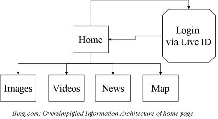
  1. Information Architecture This is the sitemap & structure of your website. For example, when you visit http://bing.com what options do you have for interacting with the site, some include (a) Typing a search query & submitting the form (b) Clicking on maps link (c) Clicking of the about us link etc.  These three options represent navigation pattern, the conceptual layout & the flow (form submissions showing a result page) of the pages. However, The Information Architecture does not depict logic of page flows, but just linkage of pages. Here is a simplified Information Architecture of bing’s home page. Bing.com Information Architecture Example
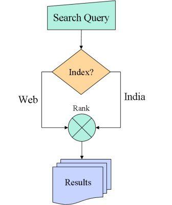
  2. Interaction Design This is the flow chart of your website which captures a lot of details which shows how the pages could interact with each other and under what conditions. For example, a home to login linkage on the Information Arechitecture would show a linkage from the login page to the my dashboard whereas the interaction design would capture how the user can or may not be allowed to navigate from the former page to the latter. A login interaction has logic to check for user name & password validity, account expired/active status, session timeout, etc. The interaction design builds upon the elements of Information Architecture (the “login” & “my dashboard” page) and applies logic to connect them together. Here is a simple interaction depicting which “index” to be picked up for the given search query.Bing.com visual interaction example
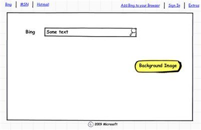
  3. Wireframes A Wireframe provides the guide to the layout of the page, where the buttons go, where the form is, image, nav bar, etc. It is also developed by the product manager. Here is an example wireframe of bing’s homepage:Bing.com Homepage Wireframe
  4. Visual Design The visual designer (aka the “photoshop” expert) converts a wire frame into a mockup. Different screens could have different wire frames hence different mockups. The designer may do HTML/CSS/JS mockups from the wireframes without going the photoshop route. The visual design goes into the details of every pixel which may be manipulated on the screen. Here’s the visual design output of bing (which you may have seen already)Bing.com Final mockup

Who does what? What are the roles & responsibilities?

1. Product Manager Overall responsibility. Creates the Information architecture. May take help of software/system architects for existing components and their behaviors. May engage web designer for existing sitemap & functionality. For startups, the Product Manager role may be assumed by the CEO, CTO or an architect on board.

2. Visual Designer Does final mockups based on wireframes and IA. May also do the final HTML/CSS.

3. Web Developer Converts the HTML/CSS using Javascript to product a working user-interaction.

The user-interface once connected to the back-end becomes complete & is revisited for usability testing, customer feedback, focus groups, scenarios etc. More about them in a future post.

(The bird is a Green Honeycreeper found in Mexico & Brazil. Pic courtesy Dario Sanches)

Build. Sell. Build. Sell. Lather. Repeat

Tuesday, August 25th, 2009

One of the biggest dilemmas faced by an entrepreneur who is starting up is to figure out when to stop building and when to start selling. Although, easy it may sound there are no hard boundaries between one or the other. Once, you have 5-10 people in the team then the question is different — you can have half of the team building the product and the other half selling it. What do you do when you have have 2-3 members in the team?

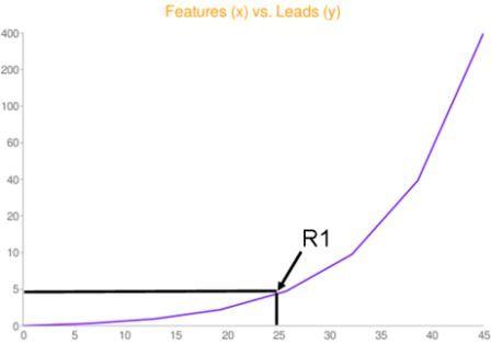
The idea is simple — build an initial set of features and then instead of only building, you, build, sell, build, sell. Repeat. Put a constraint that for every 5 new features, you acquire double the number of leads (or users if you are a consumer internet  product) than the last time. That would be a perfect balance.

Here is a chart depicting a hypothetical idea where for every 5 new features you add to the system, you double the number of leads you acquire (or acquire users for consumer internet products). ‘R1’ in the figure below represents a baseline set of features for acquiring first set.
features_releases_leads

Lead (definition): A prospective customer, or someone who you have talked to but is not ready to use your product unless few more things are added. Or he is a free/trial user but not ready to pay the money, yet (Keeping it broad so that theory could be modified in specific situations)

Requires great discipline. As a coder-entrepreneur you may wanna go into the “comfort” zone of continuously building or if you are a non-techie entrepreneur you may just sell without a product in hand. Both are extremes and equally detrimental. Especially, in Indian conext where capital is meager and having the revenues in the books is golden, you strike a balance until your next inflection point where you are cash-flow positive.

So, how do you attain that perfect balance between sales vs. development OR feature build vs. lead acquistion? Here’s the recipe:

  1. Build an initial version of the product which has some baseline features. These features may be targeted or have been developed after talking to a set of potential customers.
  2. Call that base version as alpha, beta, R1, whatever. Sell the product or convince your leads to start using it. Maybe a small set of people would start using it.
  3. Don’t start building new features, just yet — Talk to them. Get feedback.
  4. Now, add another set of features and then widen your net to bring additional leads (or convert existing leads who may have told you that they would use the product if a, b, c is implemented)
  5. Now, don’t go incremental, go exponential in acquiring leads (or converting them). For every 5 new features, try to double your lead flow.

(The above example; for consumer products however, you may add few zeroes to the y-axis legends to get the point).

Thanks to Ankit, Sameer & Nandini for vetting the thoughts & clearing bugs in the draft