 User Interface is the visual part of your product; this is where all your back-end gets exposed. This is where your users interact with your application tier, middle-tier, database-tier, third-party & whatever-tier. The user interface could be visual, wherein for web products you have HTML pages interacting, for desktop-based products it’s your screen (or window) where the user interacts by clicking links, submitting forms, scrolling windows, or even closing the application.
The user interface design consists of four parts and is normally done in this order of development process:
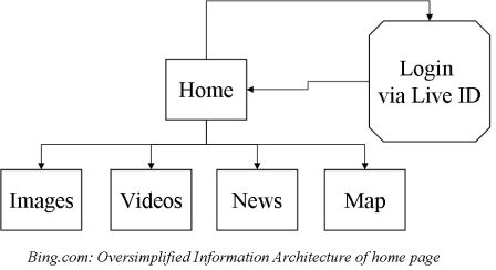
- Information Architecture This is the sitemap & structure of your website. For example, when you visit http://bing.com what options do you have for interacting with the site, some include (a) Typing a search query & submitting the form (b) Clicking on maps link (c) Clicking of the about us link etc. These three options represent navigation pattern, the conceptual layout & the flow (form submissions showing a result page) of the pages. However, The Information Architecture does not depict logic of page flows, but just linkage of pages. Here is a simplified Information Architecture of bing’s home page.

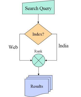
- Interaction Design This is the flow chart of your website which captures a lot of details which shows how the pages could interact with each other and under what conditions. For example, a home to login linkage on the Information Arechitecture would show a linkage from the login page to the my dashboard whereas the interaction design would capture how the user can or may not be allowed to navigate from the former page to the latter. A login interaction has logic to check for user name & password validity, account expired/active status, session timeout, etc. The interaction design builds upon the elements of Information Architecture (the “login” & “my dashboard” page) and applies logic to connect them together. Here is a simple interaction depicting which “index” to be picked up for the given search query.

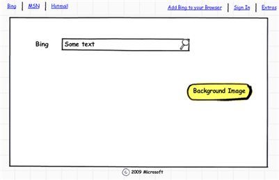
- Wireframes A Wireframe provides the guide to the layout of the page, where the buttons go, where the form is, image, nav bar, etc. It is also developed by the product manager. Here is an example wireframe of bing’s homepage:

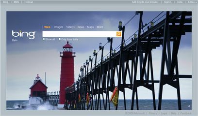
- Visual Design The visual designer (aka the “photoshop” expert) converts a wire frame into a mockup. Different screens could have different wire frames hence different mockups. The designer may do HTML/CSS/JS mockups from the wireframes without going the photoshop route. The visual design goes into the details of every pixel which may be manipulated on the screen. Here’s the visual design output of bing (which you may have seen already)

Who does what? What are the roles & responsibilities?
1. Product Manager Overall responsibility. Creates the Information architecture. May take help of software/system architects for existing components and their behaviors. May engage web designer for existing sitemap & functionality. For startups, the Product Manager role may be assumed by the CEO, CTO or an architect on board.
2. Visual Designer Does final mockups based on wireframes and IA. May also do the final HTML/CSS.
3. Web Developer Converts the HTML/CSS using Javascript to product a working user-interaction.
The user-interface once connected to the back-end becomes complete & is revisited for usability testing, customer feedback, focus groups, scenarios etc. More about them in a future post.
(The bird is a Green Honeycreeper found in Mexico & Brazil. Pic courtesy Dario Sanches)